Dashboard
- If
- I put a brief summary of every tab on the customer's home page.
- Then
- Calls should get shorter, and operators should have more time to sell.
- Because
- They find answers to simple questions in one place and open the tabs only for details.
I rebuilt the operator workspace of a major telecom's call centre as one clickable dashboard, using an object-oriented UX approach, and tested it with six people who had never worked in a call centre.
−59%estimated time on the main operator tasks in usability testing
I started with object-oriented UX. I listed every object an operator works with and all the information a customer can have, then grouped them into logical blocks. That structure became the basis of the interface and made it more intuitive to work with.
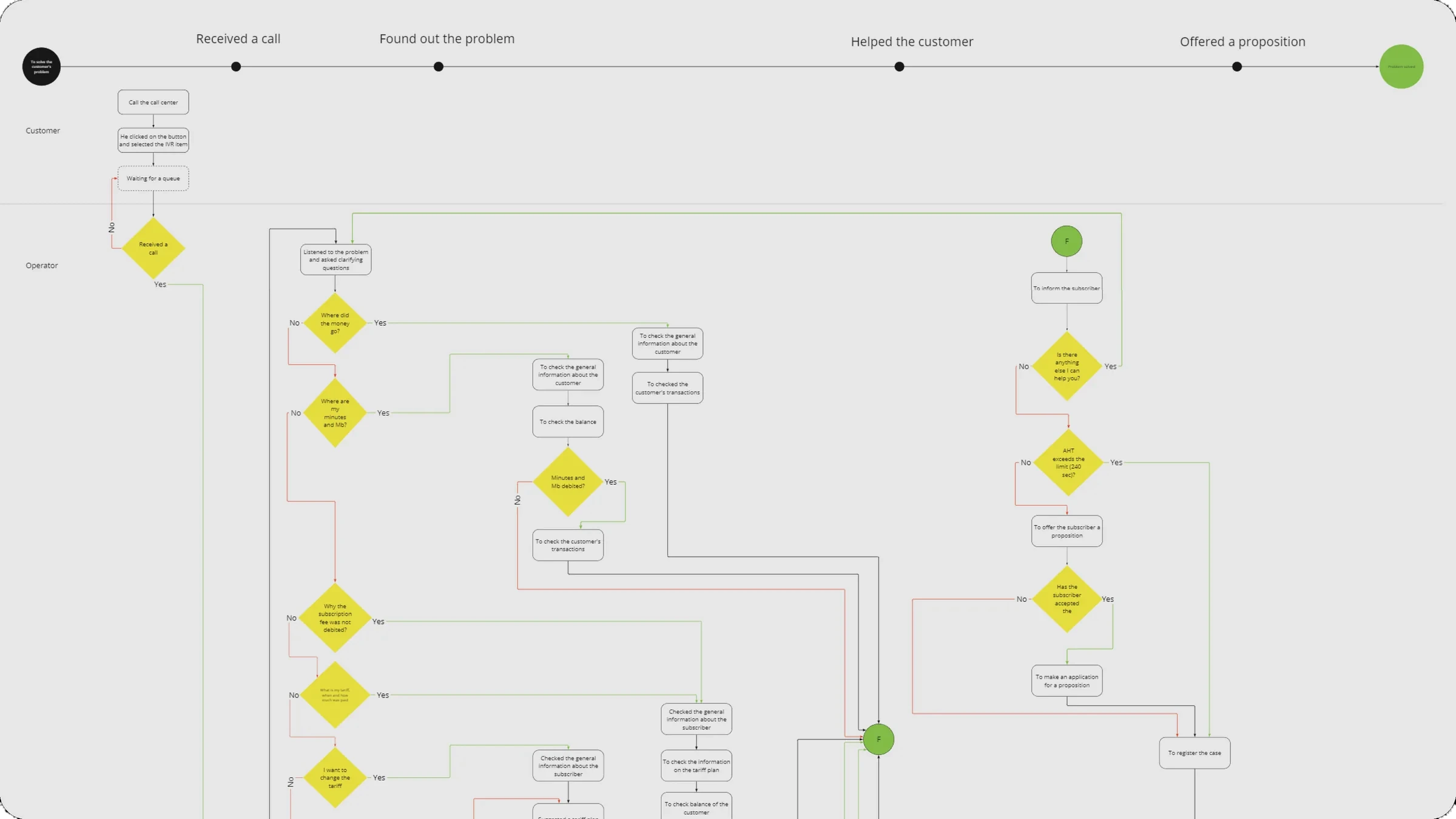
Then I mapped the business processes and walked each one through its basic scenarios, such as "Where did the money go?". It helped me check that the functionality I designed held together across the main cases.
 123
123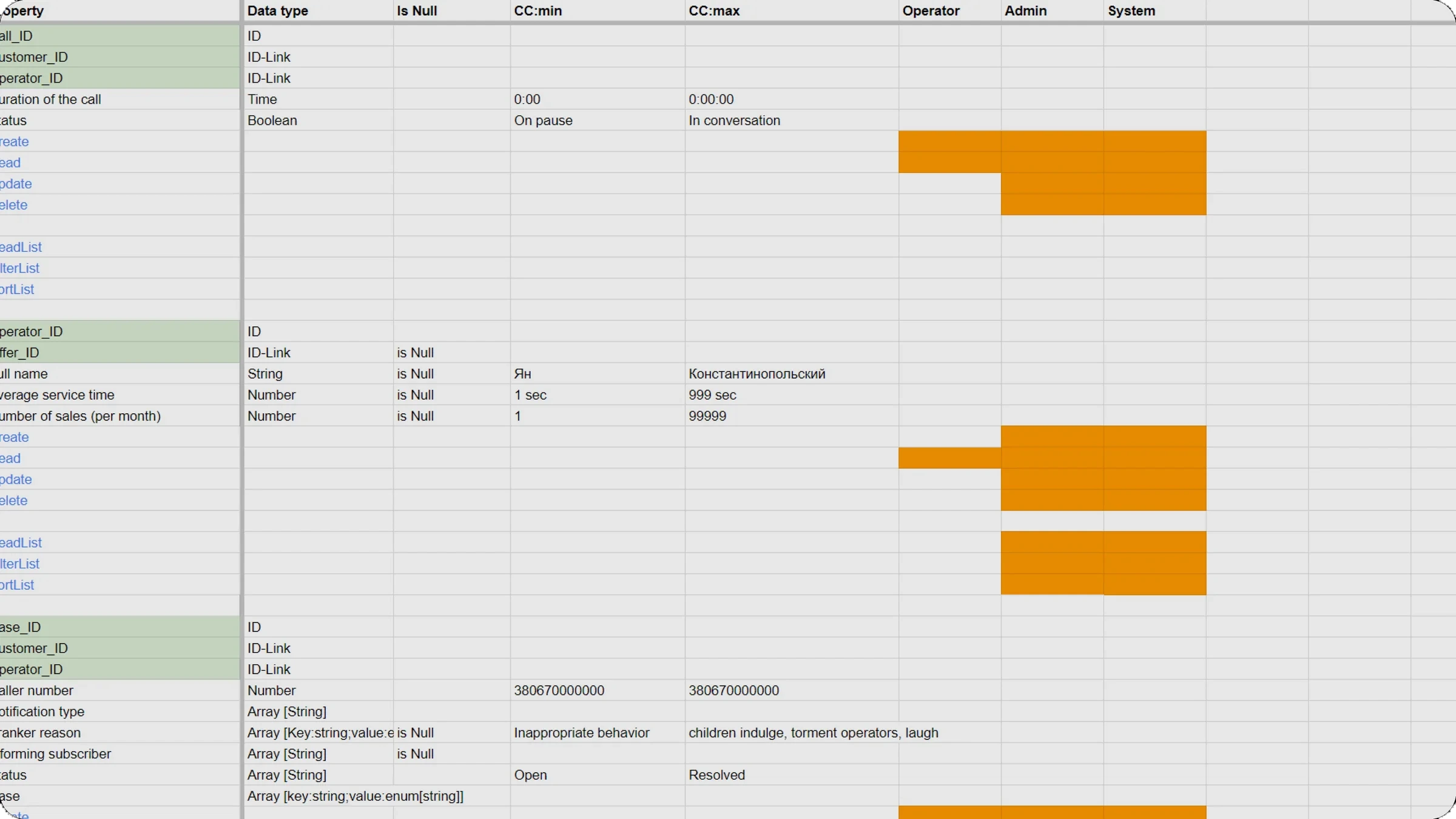
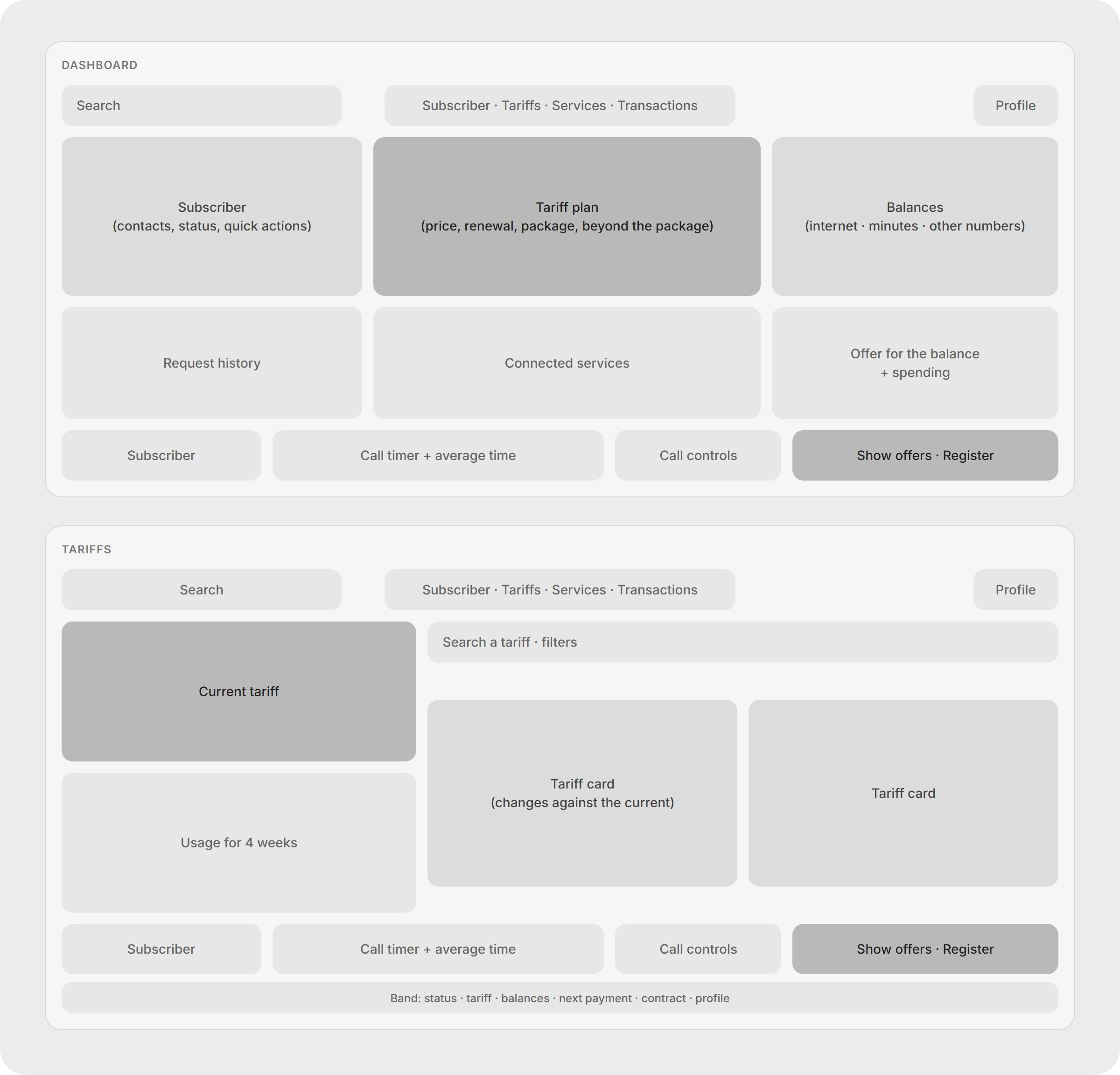
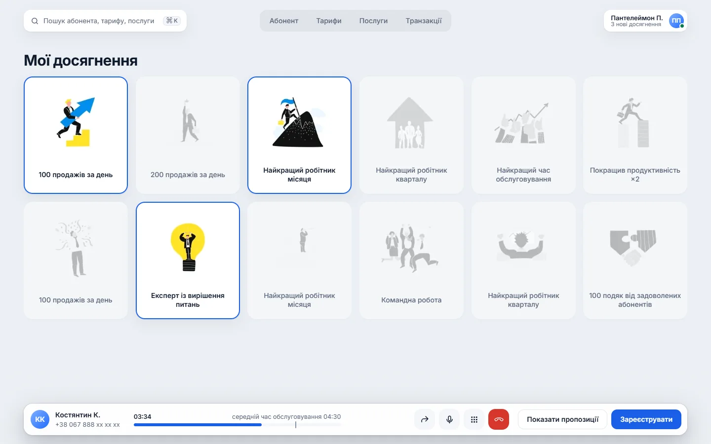
For the layout I took a cue from music streaming services like Spotify, which keep playback controls at the bottom. In a sense, an operator is also a listener: they help customers solve problems and bring revenue to the company.
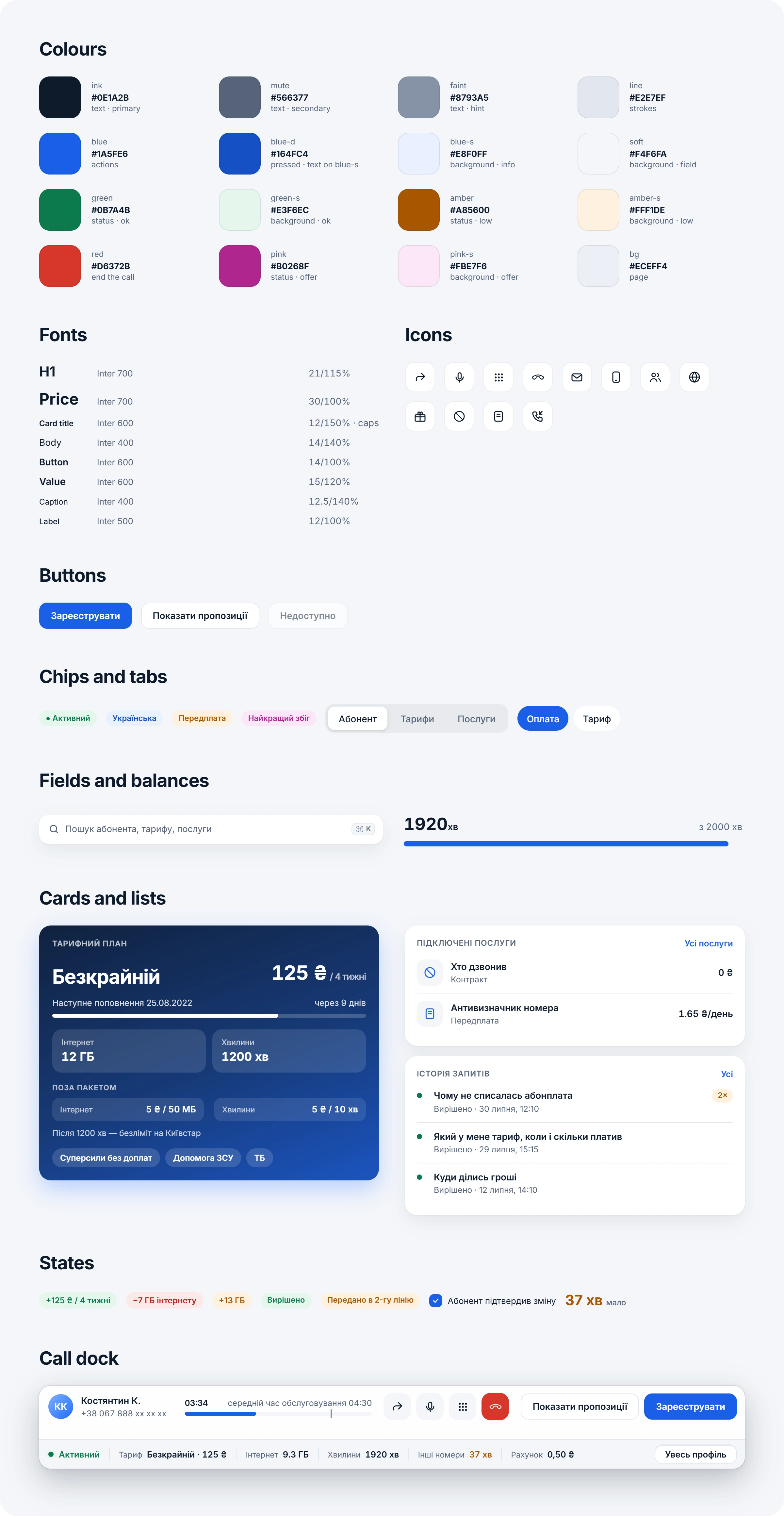
The visual style uses the fonts and colours the client already had, so the product stays consistent.
Nine hypotheses that link interface changes to business goals: shorter calls, faster training, more sales. Each comes with its reasoning. The effects, including the percentages, are expected outcomes the design was built to test, not results of the testing.
Method. Six participants, none of whom had ever worked in a call centre. Each had five minutes to explore the interface, with an introduction to an operator's main tasks. Then they worked through those main tasks by answering five key questions:
Observations. Everyone finished onboarding within the time given and found the answers to all five questions quickly.
Tested with six people new to call centres. The −59% compares main tasks in testing with an average whole call (per the product manager), so it shows a direction, not a measured saving.